A high-quality company website is a vital resource for anyone looking to build their business online. It is all about turning visitors into buyers – letting people know you have what they need and selling it to them before they leave. This is easier said than done. A great web design can help you reduce the bounce rate on your landing page and send visitors to information pages and online stores. A bad one will see them click off and try your competitors instead.
There are many principles involved in great web design. When you work with professional web designers, you should have access to them all. These designers can take advantage of each element to build something beautiful, engaging, and great for business. Here are some of the key starting points.
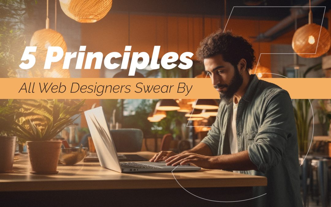
5 Important Principles for Website Design
1) Visual impact
This might not be the most important consideration when it comes to your long-term plans. However, the visual impact of your website is crucial when drawing people in and keeping them on-site. There is a lot to consider here, and a professional web design team will go through a detailed checklist with you to provide everything you need.
A couple of crucial points are the typefaces and the colors used. Color psychology can’t be underestimated with company websites. The right color choices, with strong complementary options, will make you stand out from competitors. It will give an immediate sense of who you are. For example, you could go fairly monochrome to appear high-end, favor primary colors when appealing to kids, or work with feminine pastels for beauty and well-being. Whatever you choose, you need to be sure there is enough consistency in the design across the whole website.
2) Accessible information
You can’t have a good web design without all the appropriate information. Visitors need to be sure they are on the right website, for a start. So, it has to be clear who you are, what you do, and why you should stick around. There are three crucial elements to portray this information. Text is vital, with a nice welcoming statement, tagline, and other important brand information on the homepage. However, be careful not to overload the page with text and make it look like a dissertation instead of a landing page. Less is more.
This is also true for the images on the pages. Stick with a couple of high-quality complimentary images that showcase your brand. The more engaging and memorable, the better. If you can tell people who you are and what you do in one single background image, then that’s perfect. Then there’s the menu with all the links to other pages. We will discuss this more in a moment.
3) An attractive layout
Once you have the content you need to go on your page, you have to arrange it pleasingly and effectively. The wrong pattern could mean people get overwhelmed or confused enough to go elsewhere. The right pattern will inform them and lead them to where they need to go. There are two common approaches here. Some designers will use the F pattern for their landing pages. This is where you start at the top left, read down the page, and then look at additional information to the right. It’s a natural and effective way to work. The alternative is the Z pattern. This is more common on pages where you need people to follow certain steps and engage in an action button at the end. Find the option that works best for you, make sure all the buttons and CTAs are in the right place, and don’t forget to work with the negative space.
4) Conveying a purpose
You can’t lose sight of your business goal and endgame when designing a fun and attractive website. You need to make sure that the site plays to your target audience. The points above about the visual impact go a long way here. You want a design that makes a specific demographic feel as though they are in the right place. From there, you need to make sure that those visitors get to wherever they intend to go and benefit your business. This means making sure that all the information in the text is accurate, relevant, and encouraging enough to generate sales.
Are you promoting your product or service the best you can, or is vital information missing? Do you have enough information about your brand’s story, ethos, and community spirit? These pages can help new visitors connect with your brand and act and help them make their final choice. Are all the products available to view and buy online? The danger here is that you might start overwhelming the customer again. But, the right web design team can structure your website to make it all flow with ease.
5) Building Something User-friendly Website Design
Finally, all these pages and all that product information are worthless if visitors can’t find it. Accessibility and navigation are essential to maintain those click-through rates and boost sales. Accessibility means the site is easy to read, on both a web browser and a mobile device. Don’t neglect the latter because so many consumers shop on their phones these days. Navigation means an easy route through the site with a clear menu of options and working links to all your content. A quality drop-down menu should open up everything visitors need with ease.
Work With A Professional Website Design Team For The Best Results.
You might look at all of this and think that with the right software and some practice, you can do it all yourself. However, this list only scratches the surface. There are tried and tested design principles that leading teams use to great effect. They have perfected them to the point where they transform a brand’s online presence. You need someone with the skills, training, and right programs for a high-end result. So, make that call and get started on something amazing to elevate your business online.